Arc, and what it tells us about the web
Arc is a trendy Chromium wrapper program. Its marketing page is loaded with incredibly hazy and vague wording, boasting that it contains “everything you care about, all in one place” and that it’s “your space to breathe on the internet”.
I am incredibly turned off by this kind of branding. Perhaps it’s just my inner programmer speaking, but I find myself attracted to landing pages that are up front about not only benefits and features, but also tradeoffs and shortcomings. Ripcord comes to mind—it defines itself with a terse opening paragraph and follows it up with a columned list of bullet points describing what the software has to offer. You can make an informed decision within seconds. No bullshit.
In the face of all of these red flags, Thursday morning boredom convinced me to give it a shot regardless.
As with any 21st century startup, access is exclusively by wait list or invitation only, and is also currently only available on macOS. A friend was kind enough to send me an invitation completely unprompted, though (thanks, Eric).
Immediately after dragging the 650 MB mammoth into my Applications folder and launching it, an animation began to appear on my screen: a transparent, particle simulation splash screen that drew itself atop all other applications that eventually materialized into the actual window. It was complimented by some sound, too, which I thought was cute and kind of endearing. I like software that isn’t afraid to be a little fun.
What I didn’t find fun, though, was immediately being asked for an email and password. Despite this mood whiplash, and after skimming the Terms of Service with an eyebrow raised, I decided to try the browser out anyways. What I found that it wasn’t actually so bad, but it functions as a confirmation that we are now inescapably ensnared within Web Hell.
What Arc actually is
Arc is a web browser built atop Chromium. For a second, let’s ignore the fact that it’s using an engine created by a multi-billion dollar ad conglomerate that wants to sell your identity and focus on what it actually has to offer.

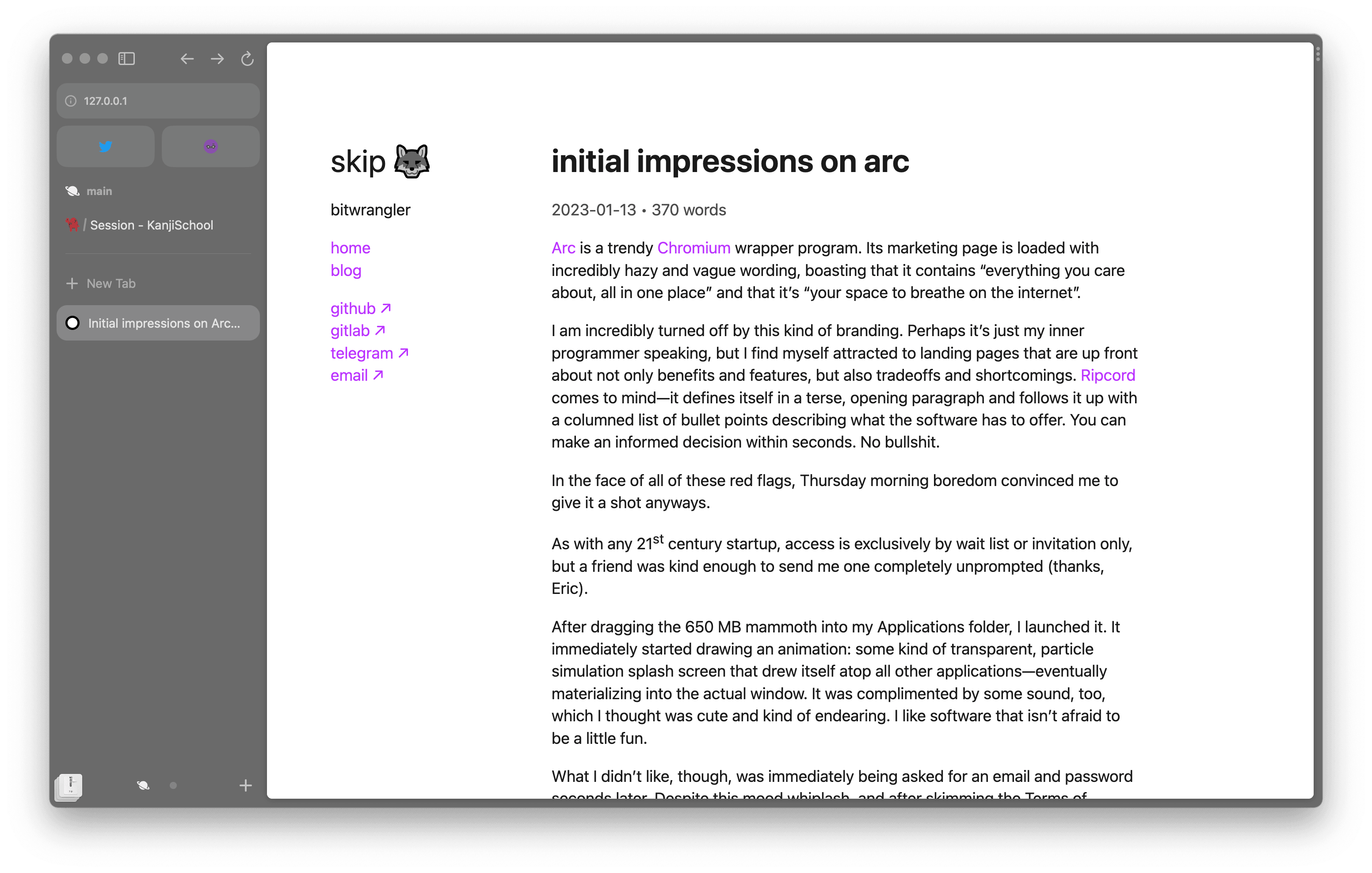
Arc eschews the traditional browser chrome, instead using a vertical sidebar on the left side that holds the address bar, navigation buttons, refresh icon, and tabs. Arc doesn’t completely dispose of modern web browser concepts, but decides to glue them together in seemingly novel ways.
Tabs
Arc treats tabs as inherently ephemeral, automatically archiving them after a configurable period. This is convenient for me because that happens to be the way I treat them, too—it even provides a small UI control to close all tabs for you. Archived tabs can be revisited in the Archive, where you can also filter by tabs that were manually or automatically closed. This seems to be its solution to the “tab fatigue” problem.
Important tabs can be pinned. Pinned tabs aren’t archived automatically, but what I found interesting is that they remember the exact URL you pinned and provide a shortcut to quickly jump back to it. For example, if you pin your YouTube subscriptions page, clicking on the favicon jumps you back to it after e.g. watching a video or browsing around. This way, you can decide the logical “homepage” of the tab. Closing the pinned tab actually just resets it to this URL, which is neat.
Spaces and Profiles
Sets of tabs, both pinned and unpinned, are collected into Spaces. This seems to be purely organizational. Each space gets its own theme, name, and (optionally) icon. Delineations like these can be useful for work and school.
Spaces can be further assigned Profiles, which are a lot like Firefox’s containers feature, but seem to literally be Chrome profiles, because not only is browser data (history, saved passwords, cookies, etc.) separated, but extensions too.
Tabs can also be favorited, which essentially means “pinned, but further accessible across Spaces”.
Command Palettes
Arc embraces the “command palette” pattern and employs it in many corners of the UI. Focusing the address bar or trying to open a new tab just opens a command palette instead, letting you search through your history, jump to an already open tab, or make a query in your search engine.
This makes sense—sometimes you want to open a new tab just to find out that you actually had the page you wanted already open somewhere else. Recent versions of Chrome and Firefox do this, too.
Arc’s command palette not only lets you filter through open tabs, but also allows you to create a new Space, edit the theme, open an extension’s pop up window, etc.
Little Arc
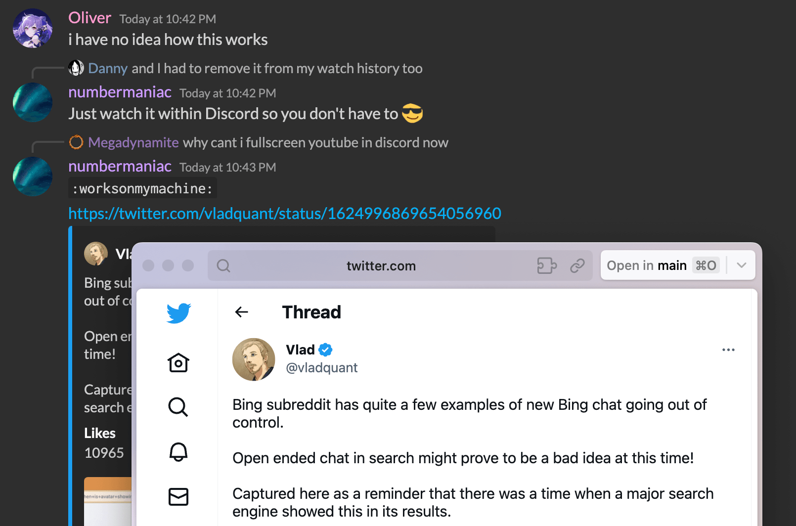
Something that I haven’t actually seen done anywhere else is this “Little Arc” feature, which is a transient browser window that appears when you open a webpage outside of the browser. In any other browser, you’d expect a new tab to open. Instead, Arc opts to pop open this cute, HUD-like window to let you see the page without having the main browser window pop into view. Pressing
⌘O opens the page in a new tab in a full browser window.

I like this. It’s neat, and it prevents my main window from getting overloaded with tabs. Sometimes, taking a quick peek at something is all I need. Little Arc can be opened through a global hotkey as well, which comes in handy whenever I remember that it exists.
Web Hell
So, that’s Arc. I think it’s useful. Actually, I’d even go as far as to say that I like it. I’ve been using it as my main web browser since I’ve installed it. I think it’s fairly neat, and it’s been materially useful in my day-to-day life at home and in school. I’m glad to have been invited to test it, and to have installed it.
However, I believe that its existence—let alone an entire startup founded with the sole purpose of developing it—serves as damning evidence that we’re trapped in Web Hell.
Much like Electron, Arc encourages you to keep a set of websites constantly within reach through Favorites. These deserve to be full blown desktop applications; not “documents”—especially not “documents” that bring in hundreds of kilobytes or even multiple megabytes of code necessary to imitate the rich user interface that you already have on your system. And oftentimes, it’s shoddy enough that it crumbles the moment you want to do something sufficiently complex.
Arc lets you create splits to display multiple pages side by side, both in vertical and horizontal orientations. But isn’t this the job of the OS’s window manager, or perhaps the UI framework underpinning every program on the system? What’s this feature doing in a web browser? Being able to arrange two pieces of information or user interface so that they appear adjacent is something that I should be able to do to everything, everywhere, no matter what it is; replicating basic windowing as a bespoke application feature is an anti-pattern.
Arc includes a screenshot feature. Again, something that should be part of the system. macOS and Windows already provide competent screenshotting tools. If you don’t consider them to be competent, that should be either treated as a bug or an extension point that the vendor lets you completely replace.
You can create “notes” and “easels” with Arc, which are, in essence, shareable rich text files and whiteboards. Programs already exist to solve these problems—notably, Notes and Freeform on macOS, with comparable software likely to exist on Windows. (I wouldn’t know about them.)
Arc tries to be an “everything” program, which runs counter to what I consider the ideal program to be: a piece of software that does one thing and does it well, providing extension and scripting points for other applications on the system, adhering to human interface guidelines for a consistent user experience, and cooperating and integrating with first-party operating system features.
Reality Check
I understand that these features are, for the most part, useful additions that go appreciated by a lot of people. I’m not blaming Arc, the team that builds it, or really anyone in particular for my heartache and longing for my Ideal Platform.
It pains me that the operating system failed, even though it makes total sense. Where else can you find something so low-friction, ubiquitous, and automatically sandboxed? Who wants to click through an installer (that would probably try to install adware) just to check the balance of your checking account? Wouldn’t it suck if your bank didn’t support your operating system, so you were forced to run it through Wine? Who would want to learn and maintain and bear the weight of two codebases for what could be one?
But at the same time, doesn’t it suck that web browsers are so impossibly complex that it’s economically infeasible for a new one to be developed, enabling a single corporation to sink its greedy claws into the market as the browser engine that the majority of people use? I don’t foresee another opponent jumping into the ring with Google, Apple, and Mozilla anytime soon; something optimized enough to handle the complex web applications of today with the speed and efficiency that users require is an immense feat.
And every time I write JavaScript, the lack of thought put into its design and its microscopic “standard library” are made very apparent to me. The churn of trendy frameworks, libraries, and Twitter threadfluencers makes me want to swear off computing, start a farm, and milk cows for a living. People build their entire careers off of a platform that, by necessity, has to throw away perfectly good design paradigms, windowing, cross-application automation, and accessibility features that people are already familiar with.
It feels as if there’s a slow decay in place. Sometimes I don’t find myself
particularly thrilled with a certain design decision made by the designers of a
website. I expect to be able to pop open the developer tools, locate the
classname of the offending element(s) in question, and write a quick userstyle
to alleviate the issue. Instead, I’m greeted with a waterfall of nested <div>s
with randomly generated classnames, the structure completely opaque and
indecipherable. Websites are no longer documents, but instead delicate Rube
Goldberg machines that emit a maze of DOM nodes that only a carefully written
and optimized browser engine can render in reasonable time.
It feels like the user is losing control.
There’s a certain balance to be struck here, and I’m not attempting to propose a solution. I just wanted to lament for a second.
