iPhone 14 Pro subtleties
Dynamic Island
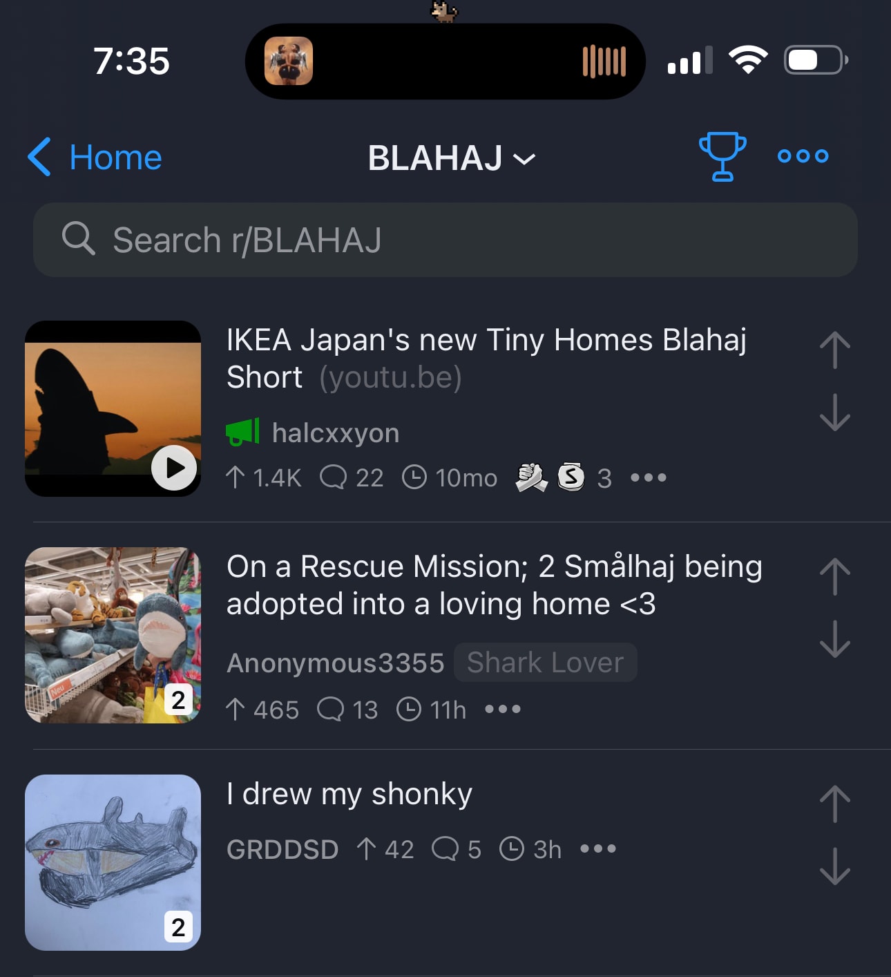
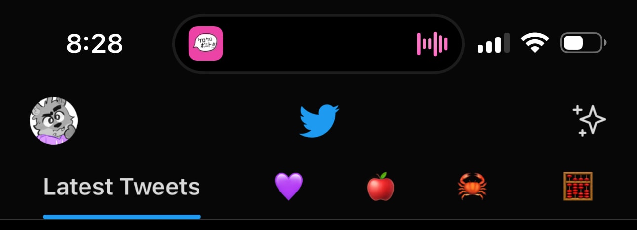
The Dynamic Island is a black pill drawn in software and hardware1 that engulfs the front-facing camera and Face ID sensors, giving the illusion of a single, contiguous form that lives at the top of the display. Notably, it additionally acts as a heads-up display for any live activities going on.

The Dynamic Island also displays camera and or microphone usage indicators and is responsible for drawing the lock icon that appears when the phone is locked with the Always On display enabled.
It seems to only appear in screenshots when an activity is being displayed, but this behavior doesn’t seem to be consistent.
Details
Half of what makes the Dynamic Island good is the animations. The island constantly fluidly reshapes and morphs itself, bouncing and splitting back and forth and even pushing around the other status items onscreen in order to display what’s going on in the background.
When leaving an app that is in the middle of the activity, the animation even responds to the angle of the swipe.
Although it’s a bit more awkward in this video because of the screen recording (which itself is a “live activity”), notice how either the clock or Wi-Fi indicator gets smacked depending on whether you swipe northeast or northwest. It’s a nice little detail which is made even better by the 120Hz ProMotion display, and it’s definitely a little fun. It reminds me of the genie window minimization effect present on macOS, which I actually have disabled because it’s too slow and not as fluid.
Another small detail. If the area behind the island is dark, then a barely-visible outline is drawn around it:

This makes the island take on a discernible shape at all times, even on dark backgrounds. This reminds me of the home indicator, which does some color math to do the same thing.
Something I also noticed is that after expanding the island (with a long press) and closing it, it returns to a size that is larger than usual. It then slowly shrinks over time back to the usual size. Any status icons that would be covered by the larger island reappear after the neutral state is reached.
I can’t get a screen recording of this (because it bisects the island and makes this behavior harder to spot), but I assume it does this to make it easier to reactivate the island right after closing it. Initially, I didn’t notice this at all.
Speaking of (un)expanding, Apple pointed out to me (in an on-boarding email) that you are actually able to swipe the Dynamic Island closed. This is fairly straightforward, but I noticed that you are actually able to stretch the expanded island a little by swiping in the other direction:
It responds elastically, subtly stretching the content of the island and hinting to the user that you can’t swipe in this direction to achieve anything meaningful.
Not only does displaying the Face ID animation in the Dynamic Island make sense, but I think it’s clever, as it naturally draws the user’s line of sight towards the Face ID sensors. Showing these auxiliary “background but not background” activities by the hardware cutouts is smart, and it was executed well. The various floating banners, status bar pills and indicators, and other ephemeral, translucent overlays of iOS were all integrated into a single element in the perfect position.
Overall, the island is fluid, light, and seamless enough that it completes the illusion of it being a cute little HUD that doesn’t have to be there, instead of something that Apple came up with to make the area around the camera and Face ID sensors less intrusive. It’s a great quality of life improvement.
Physical Visibility
Sometimes, the Face ID and front-facing camera do become more visible, causing them to “pop” out of the island. This happens in situations with decent overhead lighting (or enough ambient lighting) such as standing in a well-lit room or being outside in the sun.
This is a little disorienting, and I can’t decide whether it’s an eyesore to me or not, but it’s more than ignorable. I’ll get used to it by the end of the month… probably.
Being able to see the hardware float above the display also makes it unmistakable how much care and calculation went into placing the Dynamic Island UI cleverly enough such that it wouldn’t clip into any hardware elements, and remain visually centered at the same time. This makes me wonder how alignment will be done for third-party consumers of the Dynamic Island API (especially in the expanded state), although I wouldn’t be surprised if it just happened automatically.
Always On Display
I like the AOD. I’m not sure how much battery it uses, but I quickly got used to how it looks, and don’t mistake it for a phone that’s awake. Acting as a persistent display that shows what song is currently playing on my HomePod at all times is useful, especially since iOS 16 lets you display the album art more prominently on the lock screen.
Something that I appreciate is that Apple implemented support for swiping up from the bottom of the screen to wake the phone up while asleep—you don’t have to tap the screen to wake it up first. Because AOD blurs the line between asleep and awake, this is something I subconsciously began to do. I’m glad this was anticipated, as it makes for a more fluid and frictionless experience.
Case Study: Navigation
I almost always use a GPS when I drive. Apple Maps is the app of my choice, mostly because I find the spoken navigation utterances to be easier to understand and because it integrates with iOS and watchOS the best (I wonder why).
Swiping away from Maps directs the Dynamic Island to display which direction to turn, and how far away that turn is. I feel like this helps with ADHD, as I’m never left wondering.
Nearing the navigation point causes the island to automatically expand over whatever is onscreen and count down the distance to the maneuver.
I was pleasantly surprised to find out that Maps integrates with the Always On Display. The map view blurs to be entirely illegible, instead leaving the upcoming street name, icon, and distance that keeps on updating as you travel. Other information such as time remaining, estimated time of arrival, and remaining distance are also displayed and updated.
As someone who’s forgetful and constantly distracted by seemingly everything, having these continuous forms of vital information displayed at all times is really nice.
I like these features. All of them working in tandem means it’s virtually impossible for me to miss important info, and it gives me useful hooks into ongoing activities.
Footnotes
-
According to Apple, the Dynamic Island is anti-aliased with special hardware and software. This seems to have paid off, because the boundaries of the island are incredibly sharp and appear uniform with the display edges. It looks good. ↩
